Bring the fabrics into one light
Two dark garments can seem identical on separate hangers and noticeably different when worn together. Start with the complete outfit in daylight where a suitable viewing space is available. Keep the garments beside one another so their surfaces receive similar light.
Look for the most obvious difference first: one may be matte, another shiny, softly textured or lightly transparent. These are useful design relationships, not automatic faults. A tonal outfit can gain interest from mixed surfaces if you enjoy the combined effect.
Distinguish tone from material
A brown-black, blue-black or grey-black surface may become more noticeable beside a deeper black. Describe what you see without trying to settle an exact colour name from a phone image. Cameras can exaggerate or suppress differences in dark fabrics.
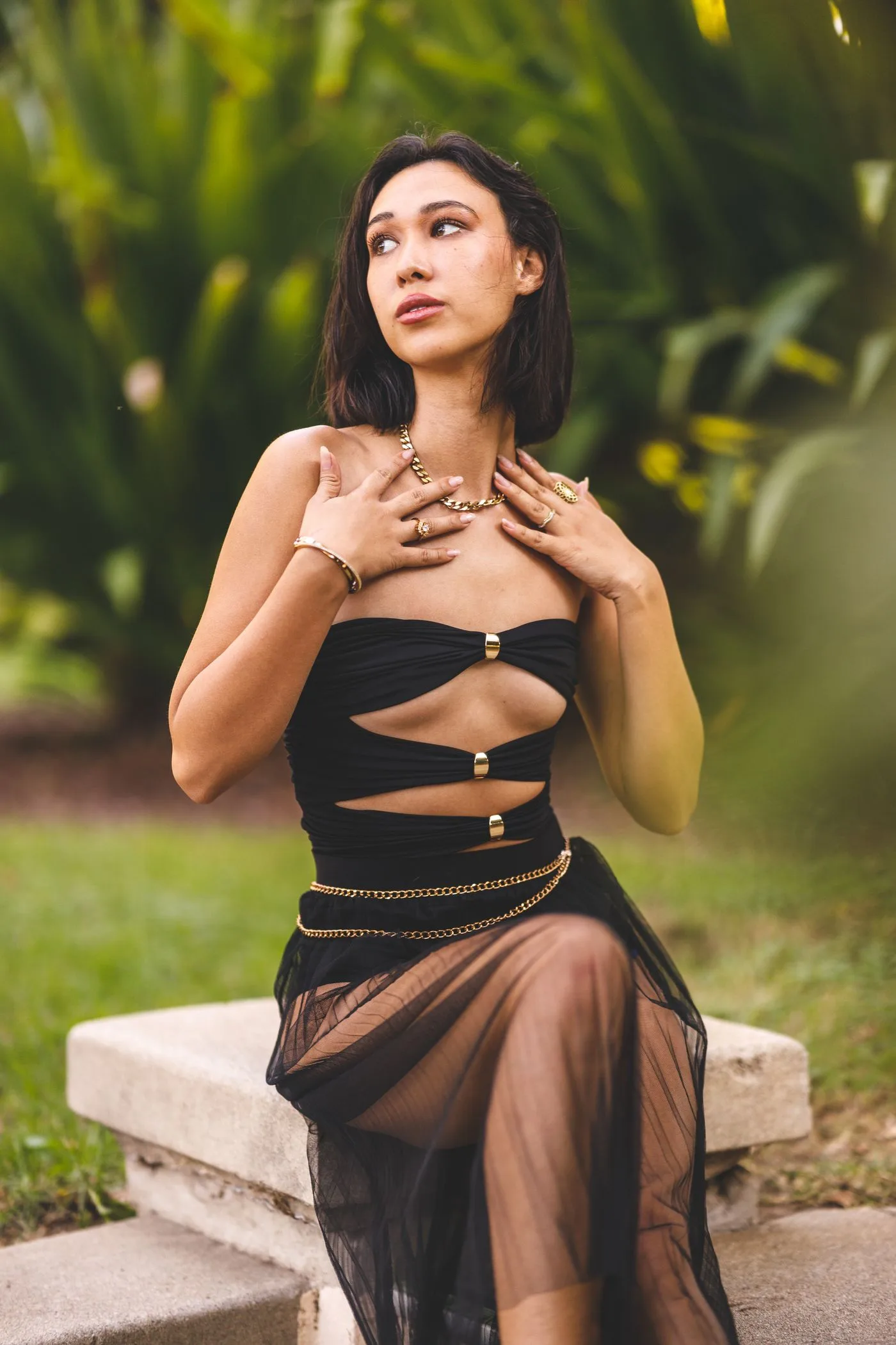
Read the actual material and construction information when it matters to intended wear. A sheer-looking panel, lining or layered area should not be understood from a distant photograph alone. Compare with the underlayers you really plan to use and choose the level of coverage that suits your own purpose.
Check the transitions
Look at the point where the upper and lower garments meet. A shiny top beside a matte skirt can create a clear boundary, while similarly soft textures may blend. Notice whether a waistband, seam or contrasting belt adds another line at the same point.
If the middle feels busy, remove an optional accessory first. You may prefer the fabric transition without an extra metallic detail. Keep the garments themselves unchanged for the initial comparison so the effect of the accessory is clear.
Include movement and ordinary light
Stand, sit and move naturally within the available space. Different fabrics fold and catch light differently, and a still pose can hide that interaction. A group that looks coherent while standing may produce a stronger contrast when one fabric gathers.
Check the outfit again under the indoor lighting where you expect to wear it, without assuming daylight is the only valid view. If one material suddenly dominates, decide whether that effect suits the occasion rather than automatically rejecting the outfit.
Keep each care label linked to its garment; similar colours do not mean the fabrics share a washing routine. Finish by naming the combination you like: matte against sheen, two quiet textures or a deliberate warm-dark contrast. Use that observation when choosing a retained layer or bag. There is no need to collect identical dark shades to make a tonal outfit work. The useful choice is a complete arrangement whose surface differences feel intentional and whose individual garments suit their real intended use.
Related reading
Choose Between Two Colors of the Same Garment, Repeat One Dress for Two Different Invitations.
Read how we put our guides together, or flag a correction at [email protected].