
Change the background, not everything
A white garment can appear crisp beside a dark wall and softer against a pale one. Before deciding that its colour or outline is wrong, view it against more than one ordinary background. Keep the same outfit and similar lighting so the background is the main change.
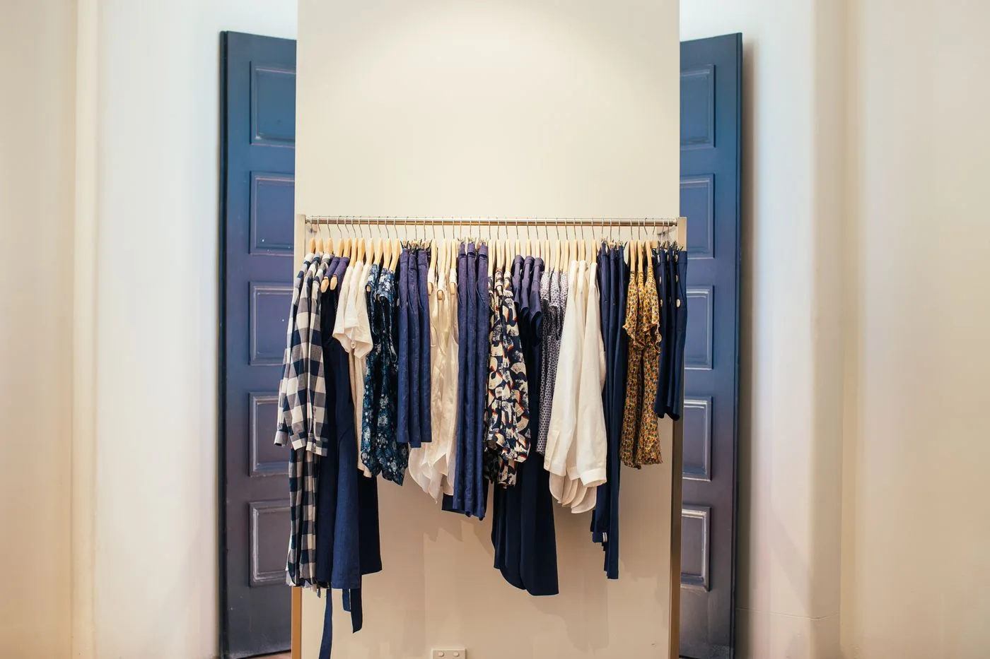
A clear mirror is useful, but notice what appears behind you. A busy rail, patterned curtain or bright window can make the garment's edges harder to read. Step to another permitted viewing position rather than relying on a single crowded reflection.
Separate colour from transparency
A visible background can influence the apparent colour of a light fabric. It does not, by itself, explain the garment's construction or intended layering. Read the product information and compare the clothes you actually plan to wear underneath where practical.
Avoid judging opacity from an overexposed product photograph or a dim fitting room alone. If the intended use requires a particular level of coverage, establish that through an appropriate real comparison and the maker's information. Do not assume every garment described as white behaves alike.
Include the retained outfit
Look at the light garment beside its actual lower half, shoes and layer. A white shirt worn with dark trousers creates a clearer boundary than the same shirt beside pale linen. The difference may be exactly what you want, but it changes the outfit's overall contrast.
Keep the amount of visible white in mind. A small cuff and a full flowing sleeve make different contributions. If the garment seems overwhelming, compare its role in the complete outfit before deciding that white itself is unsuitable for you.
Use daylight sensibly
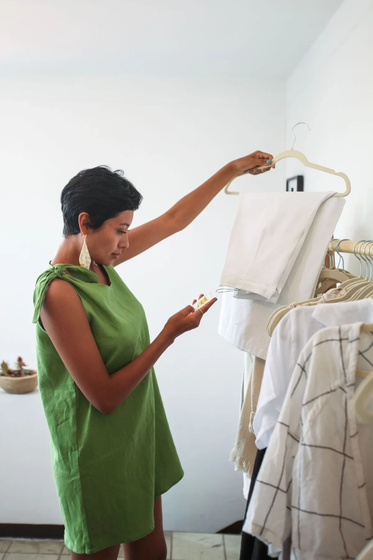
Where a suitable setting is available, compare the garment in daylight as well as the indoor light where you tried it. Follow the retailer's arrangements and keep privacy in mind. A phone image can record the combination, but it cannot certify exact colour or fabric performance.
If a photograph looks unexpectedly blue, yellow or brilliant white, compare the physical garment again. Automatic camera adjustments can change the result. Do not order several supposedly matching accessories solely to reproduce one screen image.
When the views disagree, identify what changed. The issue may be a bright background obscuring the outline, an underlayer affecting the appearance or a different lighting condition. That gives you a specific next check instead of a vague rejection of the whole garment.
Choose the piece for the settings and outfits in which you will actually wear it. A garment does not have to look identical against every wall to work well. The useful result is knowing which ordinary relationships you enjoy and which need a different retained layer or a different garment entirely.
Related reading
Compare a White Dress With the Retained Plain Layer, Check a Light-Colored Blazer in the Outfit You Will Wear.
Read how we put our guides together, or flag a correction at [email protected].