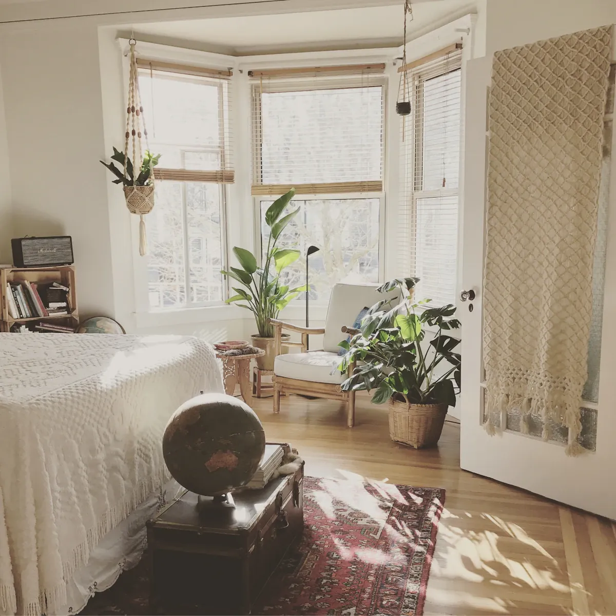
A chair textile can look richly textured in a close-up and much quieter across the room. Compare it with the materials already present before deciding that another pattern or colour is needed. The useful reference is the retained room, viewed from the positions where it is actually used.
Identify the comparison question
Choose one relationship to assess: the textile beside a timber surface, its texture against a plain wall or the amount of pattern near another seat. Keeping the question specific is more useful than asking whether a sample is generally nice.
Distinguish appearance from performance. A visual sample can help with colour and texture, but it does not establish durability, cleaning suitability or every other product requirement. Read the actual material and care information for those decisions rather than inferring them from softness or thickness.
Use the ordinary viewing distance
Place a suitable sample near the intended chair position where possible, following the supplier's sample handling arrangements. Look from the normal seat and room entrance. A small weave that dominates the hand-held view may become a modest surface at that distance.
Keep the retained furnishings present during the comparison. Removing every neighbouring textile can create a clear result that does not describe the room in ordinary use. The actual rug, curtains and other seat can all contribute visible detail.
Compare light without changing everything
Look during the room's usual daylight and evening conditions. Keep the sample and neighbouring reference in the same light for each comparison. A fabric held beside the window while the sofa remains in shadow can create a misleading impression of difference.
Notice shine, shadow and the direction of the texture as well as colour. A brushed or woven surface can change its visible character with the angle. Keep those observations specific rather than treating one photograph as the textile's permanent appearance.
Decide how much detail belongs
If the group feels busy, compare a quieter candidate while leaving the rest of the room unchanged. If it feels too plain, identify whether one existing patterned object could provide the wanted detail before choosing a busier chair fabric.
Keep the actual product reference attached to any personal sample note. Similar names or small colour variations can become confusing after several candidates have been considered. Record what was seen and under which ordinary conditions, without inventing a claim about long-term use.
A useful textile decision joins its visible role with the product information needed for real ownership. It allows a chair to contribute texture without requiring the whole room to be replaced, and leaves unresolved performance questions open until a reliable answer is available.
Related reading
Give an Occasional Chair a Real Room Role, Compare Cushion Sizes With the Sofa You Already Own.
Read how we put our guides together, or flag a correction at [email protected].